
That Instantly Cheapen Your Home
There are hundreds of small decisions that go into styling the perfect space while selecting furniture, experimenting with paint swatches, and positioning art. The slightest misjudgment, like hanging artwork too high or choosing paint in a gloss rather than matte finish, can have a surprising effect on a room.
Only few know this better than interior decorators/ designers, who have seen their fair share of fabulous (and, yes, mediocre) homes. If you’re planning a renovation or want to give your room a seasonal styling update without expert help, read on. Thru my extensive study, would like draw attention to the most common errors notice so that you don’t repeat them. Are you making these subtle styling mistakes?
Creating a thoughtfully styled home takes time, and there’s nothing more frustrating than buying the finishing touch for a room only to step back and feel like something is amiss. Is it the position of the sofa? Is the coffee table too low? When you’re close to a project, these simple styling choices might not seem important, but from interior design experts view a few subtle decorating mistakes can instantly cheapen your room. Even if you’ve splurged on a statement sofa or vintage artwork, something as seemingly insignificant as the size of a rug could undermine the space.
Curious to know if you’re committing a faux pas? I looked up to various conclusions of leading interior design experts to find out about the most common styling mistakes they noticed when they first walk into a home. From generic hardware to dated bathroom accessories, it’s clear that small details count.
Do-it-yourself decorators agonize over color schemes, fabric swatches, and furniture shapes, but they frequently do it while making amateur decorating mistakes that detract from their long-considered selections. There’s no shame in that; interior design isn’t always intuitive.
Here are list of most common styling mistakes DIY decorators make that instantly cheapen your home—and what you should do to fix them.
Decorating is all about the things you do; the colors you pick, the furniture you love, and the accents you choose to finish your space off with that perfect look that you’ve been waiting for. It’s also about the things that you don’t do (or more commonly that you do and then undo). An editorial eye is one that’s always looking for things that can go, either because they don’t fit or because it’s just too much of a good thing.
Exercise your editorial eye for long enough and you’ll find yourself running into the same missteps over and over, and not just in your work but in just about every room you walk into. That’s a good thing, because knowing what not to do can be just as useful (sometimes more) as having a firm grasp on what you should do. And just in case your eye isn’t quite as practiced just yet, here’s a few things to look for the next time you take stock of your decor. And you’ll be surprised how often you see them, even in professionally designed rooms.
- Buying Décor That’s the Same Height or Using Too Much Symmetry

Mistake: One simple styling mistake can prevent a room from reaching its full potential. “Without sounding like a drama queen, scale and proportion are the holy grail of design. “If everything is the same size or if everything is either too big or too small, your room will read like a hot mess.”
Using some symmetry adds order and balance to a space. Using too much just makes the room look boring and bland. It also looks amateurish, as if the decorator didn’t know how to create visual balance without using a matching set. And frequently that is the case.
How much symmetry is too much? If you’ve bought two of more than two things, you’re probably bordering on too much. If you create a completely symmetrical mantles cape and flank the fireplace with a matching set of chairs, it’s too much unless you’re planning something unusual for the rest of the room. If you pull matching end tables up to the matching chairs and top them with matching lamps, it’s way, way too much.
Fix: “The easiest trick is to think of your space as a city and fill it with a combination of heights and proportions. Look at any cityscape and you’ll find this intriguing mix of scale and a unique blend of fascinating shapes—that’s what you want to nail!”
- Too Many Accessories
Mistake: Displaying too many accessories looks just as bad as wearing all of your jewellery at once. I like stuff but having lots of stuff can look quite striking.
Carefully styled accessories can give your home character, but too many can look cluttered and chaotic. The most annoying thing for me is when a room is just over-cluttered with accessories. It instantly signals ‘cheap’ to me even when the accessories are super expensive. Accessories should be grouped together to create a pleasing vignette, whether it’s on the cocktail table, buffet, or bookcase. Takeaway: Less is more.
Fix: The best approach is to start with an empty space. Gather all the accessories together and take them out of the room. Then, look at the room with fresh eyes and select the spots that accessories will make the most impact and will set the tone for the finished space. Arrange accessories in sets of uneven numbers, clump small items on trays, and incorporate metal or mirrored finished to create interest in your decorations. Also, you don’t have to display everything you own at the same time. Rotate it, just as you would your jewellery.
- Styling Dark Furniture in a Small Space
Mistake: Finding the perfect décor for a small apartment space can be a serious design challenge. We often notice one key mistake in small rooms: dark furniture. Many people tend to lean toward heavy, bulky, and dark furniture pieces. Though it might seem like a harmless choice, but dark décor instantly makes a room feel cramped and cumbersome.
Fix: When it comes to small-apartment living, we need to go for lighter fabrics and finishes that will lift the space. Opt for sofas or curtains in linen or lightweight fabric and choose a light-reflecting color palette such as white, taupe, or pale yellow.
Palermo Chair
- Ill Fitting Furniture:
Mistake: It’s rare to furnish a house from scratch, and when you accumulate items over the years, it’s easy to overlook one key element: scale. When you get the scale wrong with furniture or even mouldings, most of the time it can make you feel like something is seriously off. It can definitely cheapen a space.
Fix: Before adding a new piece of furniture to your room, pay close attention to the size and height of existing décor. Make sure you consider the scale of all of the elements in a room and how they relate to each other, from rug size to art to the scale of furniture and the flow around it. The aim is to layer furniture of varying heights so the silhouette resembles a city skyline, with both high and low accents, to lead the eye around the room.
- Placing the Pieces Too Far Apart
If the seating in your living room or den isn’t close enough for quiet conversation, you’ve placed the pieces too far apart. Draw them closer until the seating area functions as a unit — not as a bunch of individual places to sit you’ve spread throughout the room. If that leaves too much empty space in your room, consider adding secondary seating area, a game table with chairs, or a reading nook.
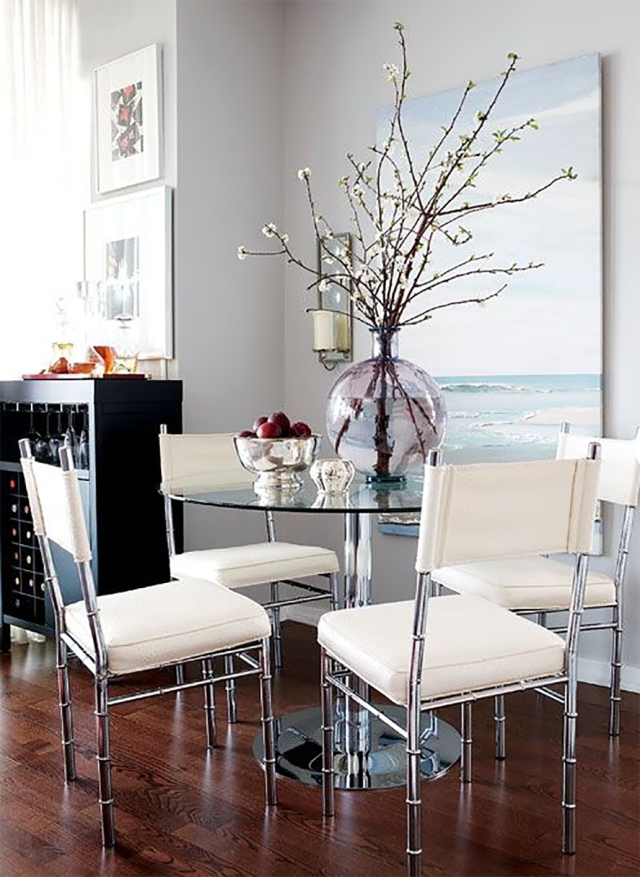
- Choosing the Wrong Rug Size
Mistake: Rugs have the ability to completely transform a room and create a point of interest, but it can be hard to judge the right size for your home. If an area rug looks like an island in the centre of your room, it’s too small. If the Small rugs, we see it virtually every day is just slightly larger than your cocktail table, it’s way too small and really aches, especially when it’s so easily avoided. In a living room or den, a rug should really ground the whole seating around it or else at least large enough to anchor the front legs of all the furniture in your primary seating area. While in the dining room, the rug under your table should be large enough to sit down or get up without pushing the backs of the chair legs off of the edges of the rug. That usually means you need a rug that’s at least 24 inches larger than your dining table all the way around.
Interior design experts agree—choosing the wrong-size rug can instantly cheapen a room. Why? Placing an area rug or the Postage stamp-size rugs that is too small for a seating area are one of the most common decorating mistakes. It instantly throws the room out of scale and gives the impression that you couldn’t afford the larger, correctly sized rug. Make sure that the rugs touch every piece of furniture so they appear appropriately scaled and make all the furniture pieces in a room relate to one another. It tells everyone that this is where the conversation is.
Fix: Living rooms almost always need [a rug that’s] at least 8 by 10 feet, if not 9 by 12 feet. Considering a 4 by 6? Don’t. That’s fine next to a bed, in a kitchen, or for an entranceway, but a 4-by-6-foot rug will assuredly not work in your living room. As a thumb rule, a rug should be big enough to fit at least two chairs or sofa legs on it.
Thankfully, you don’t have to toss a small rug. The solution is to layer. If the client has a rug that they love but it is too small for the space, an easy fix … is to layer a larger rug under the smaller one. That will not only help highlight the smaller statement rug but also create the scale needed.

- Hanging Art Too High

Mistake: Finding the perfect piece of art for your home is only half the battle. People have a tendency to hang art too high, closer to the ceiling than it should be. A key mistake we notice often is when art is hung too high or positioned in an obvious way. It’s a mistake to be too precious about highlighting the placement of your art. Just because you spent some money on an artwork doesn’t mean it won’t still look awesome over a sideboard in the hallway with a lamp and a pile of books right in front of it.
Everyone can spot cheap art, and this immediately makes a room look cheaper. The solution isn’t necessarily to spend big, though. Instead, recommend using online custom-art services or searching for unexpected pieces in flea markets or vintage stores. There are lots of cool custom art services available now, which allows you to affordably commission original art or have their prints framed and shipped.
Fix: Position an artwork in an unexpected, subtle location and follow hanging tip: Artwork should be hung at about eye-level. Obviously, this varies from person to person, so use your judgment. But it’s better to err on the side of lower rather than higher. Use a removable hook to test the placement and wait a few weeks before affixing it permanently.
If you can’t bear to part with artwork you’ve already purchased, pay attention to the frame. “One thing that can make a space look cheaper is mismatched picture frames. Using a uniform frame material like silver or wood and adding a few mattings looks much more ‘done’ and expensive.


- Following Design Trends
Mistake: The mistake people make is that they’re often insecure. They look over their shoulder and listen to what everyone else is talking about instead of sitting down and asking, What do I really love? I think the best interiors historically from over years 300 ago to now have always been spaces where people let their personal style rise to the surface and ignore the societal norms and trends.
Fix: Make it personal. Ask yourself, What does the space mean to me? What are the colors and textures I love, and what is the feeling that I want to have when I get home? Push trends aside, and make design choices based on your personal aesthetic to create a space that you’ll love for years to come

- Stock Hardware
If we’ve learned anything from IKEA hacks, it’s that updating hardware can instantly elevate an inexpensive cabinet or nightstand. It’s an easy way to get an A-lister look without spending big.
The Fix: If your cabinets and dressers still have their existing stock hardware, it’s time for an upgrade. Replace drawer and door knobs or pulls with something more decorative and of higher quality.
- Poorly Positioned Curtain Rods
Curtains for your windows are like clothing for your body.
If your clothing doesn’t fit, your body doesn’t look its best. If your curtains don’t fit your window, your window won’t look good either – no matter how lovely the shape or the moulding. In fact, a Rs10 vinyl mini-blind that fits look better than poorly fitted curtains made from Rs100-a-yard fabric.
Something as simple as the positioning of window treatments can make an otherwise spacious room look cramped. It’s a very common mistake. People often hang them right above the window, which makes the room look smaller.
Curtains that aren’t wide enough for the window look skimpy when you close them. Ideally, your curtain width — or the combined width of all the panels if you use more than one — should equal two to three times the width of the curtain rod.
Using short curtains. Curtains and drapes should just skim the floor. It’s okay if they’re longer and they puddle a bit, but they should never be shorter. Curtains that are too short have the same effect as pants that are too short: they make the wall look truncated and shorter than it is.
Curtains that are too long look sloppy, unless you have a super-formal space that calls for a puddled hem. Curtains that are too short look silly. They just flap around somewhere between the apron and the floor. Unless you’re deliberately hemming them short because of an obstruction beneath the window, such as a radiator or built-in bookcase, most rooms look best with floor-length curtains if you’re hanging them from a rod mounted outside of the window frame.
If you hang curtains from a rod installed inside the window frame, hem them to sill length.
The Fix: Hang the curtain rod about half a foot above the window frame and place the wall brackets about 6 to 8 inches out on either end. That way, everything looks larger and more opened up, and your room is more elegant.
- Cheap Lighting
Personalizing a rental? One of the most overlooked aspects is swapping out existing light fixtures, that can instantly transform a room. Updating lighting fixtures can be an inexpensive way to really help improve the overall aesthetic of any space, as well as giving a sense of sophisticated elegance and comfort.
Fix: Lighting are described as “the jewelry of interior spaces,” so it’s worth investing in. “Consider an upgrade that you can take with you if you want whenever you move, such a plug-in sconce.
- Using Lamps That Are Too Short or Too Tall
Choosing the right lamp height is just as important as choosing an attractive lamp. If you can see the harp or bulb of a lamp on your end table or nightstand, the lamp is too tall or the shade is too short. If a table lamp doesn’t illuminate your book, knitting, or whatever you do in that spot, it’s too short.
If a buffet or entry table lamp only casts light on the piece of furniture it sits on, it’s too short. Your interior lighting must be functional as well as beautiful.
Hanging chandeliers too high. You want to light up the room, not the ceiling.
Fix: Relying on overhead lighting. While it’s good to have, it doesn’t offer enough lighting, and it’s not particularly flattering. It’s better to have a mix of overhead, ambient and task lighting. Use table lamps, floor lamps, sconces – whatever you like. Just be sure to use a mix. It will provide more light as well as make the room and everyone in it look better.
- Overstuffed Sofas
A quality sofa is one of the first things experts notice when they enter your home; it can instantly elevate the furniture around it. Invest in a good sofa, especially if you have a family. An inexpensive sofa won’t wear well and will look much older than its actual age in no time. Experts warns against generic, overstuffed sofas. If you’re holding on to old furniture that is the shape of marshmallow, it’s time to consider revamping your living room.
Fix: If you’re yet to purchase a sofa, choose a high-quality fabric that is luxurious and durable. If you’re trying to elevate an existing piece, layer throw cushions in one color and multiple textures for an elegant look.

- Decorate around them.
- Using too many throw pillows.Throw pillows are great decorative accents but don’t use so many that you have to move them all of the couch, chair or bed before you sit or lie down. Just because it’s displayed that way in a store it doesn’t mean the look should be repeated in your home.
- Using tiny accent pillows.The throw pillows you use should relate to the piece of furniture. A tiny pillow on a large chair looks bitsy and lost.
- Dated Bathroom Accessories

This is one of my biggest faux pas of dated accessories like lid covers and toilet rugs. You don’t see these products sold at high-end stores for a reason. They are highly unsanitary and unsightly—they look like bad shag rugs, which don’t belong anywhere near the toilet!
Fix: Bathroom accessories can be magnets for bacteria, so make sure you launder and update them frequently. Thankfully, they’re relatively inexpensive to swap out. We recommend ditching your toilet rug for a nice rectangular rug, perhaps a flat weave. And be sure to put it in an appropriate spot in the bathroom, such as in front of the vanity at the sink or where you step out of the shower.
- Letting Your Cords Show

Many people don’t notice their power and cable cords until they take a photo of their room. Cords are a fact of modern living. You don’t have to hire an electrician to install floor outlets, but you do need to hide them as best you can. Run them under rugs if possible. Use twist ties to affix lamp cords to the backs of table legs or use scrap fabric to make decorative cord covers. Staple cords to walls and along baseboards, carefully, and then paint them with your wall or trim color to disguise them. Tie multiple computer or television cords into a tidy bundle, and then tuck the bundle behind the desk or television cabinet.
Home Decor Mistakes to Avoid
- Choosing the paint color. Paint is available in thousands of colors and can easily be changed. Choose your most expensive pieces first then decide on paint color.
- Creating a theme room. While they can be fun to decorate, people tend to get sick of them really quickly. Theme rooms look old and outdated very quickly and then you’re stuck having to spend more money replacing items you no longer want. Instead try to add elements of the theme you like into a regular room. For instance, if you like jungle themes toss in a few animal prints such as zebra print cushions or an ottoman.
- Opting for style over comfort. There are a lot of great looking items out there that look great but are totally uncomfortable to sit in. Always think about how you’re going to use the piece before you buy.
- Pushing all the furniture against the walls. Sometimes the room size can make this difficult but try to pull furniture away from the walls to create more intimate conversation areas. This is particularly important in living rooms and family rooms. Some people are hesitant to show the backs of furniture pieces but if they’re finished there’s absolutely no reason why this should be so.

Hi!
Reading and learning!
Worth saving it for our future renovation to come 🙂 very very exclusice it is….
U have detailed almost each and every bit of it for a comman man
Thanks
LikeLiked by 2 people
Thank you Wasi… appreciate you really found the content worthwhile reading…🙏😊
LikeLike
Awesome blog and has provided a wide range of products.
LikeLiked by 2 people
Thank you Ajay!!
LikeLike
Wow ….so much insight….
LikeLiked by 2 people
Thank you Sangeeta… Appreciate you feedback… 🙂
LikeLike
Interesting read…and very useful tips..keep up the good work Archana😊👍
LikeLiked by 2 people
Thank you so much Bharati… appreciations help me stay elated to always give my best… 🙂
LikeLike
Its quite extensive…. many points covered….way to go Archana …liked ur style of writing too
LikeLiked by 2 people
Thank you Sahana… your words of praise are truly inspiring and shall encourage me stay motivated…
LikeLike
Nice One Archana! keep going!
LikeLike
Thanks dear Rinku 🙂
LikeLike